Maximalist Design Tips from the Experts
In this era of clean lines and edited rooms with hushed tones and restrained colors, maximalism is a bit over the top. Riots of color, tangles of patterns, masses of artwork all can complement cushy textiles and houseplant jungles to create a thoroughly original space. Some people may not subscribe to the maximalist ideal; they argue that it is too busy and it doesn’t give the eye a place to rest. On the other hand, many others are invigorated by maximalism and enjoy a break from subdued spaces, but have no idea how to combine colors and patterns in a pleasing way. The maximalist style is not easy to achieve so we looked to Amanda Lantz, of A Lantz Design, to learn more about this look and how her firm does it so well.
She explains, “You must have an eye for balance, scale, proportions and color. A room should also always be layered with old and new.”
The best maximalist looks are carefully and thoughtfully layered, usually over many years. But there are a few tips to help create a maximalist look in your own home.
1. Maximalist Favorite: Gallery Walls
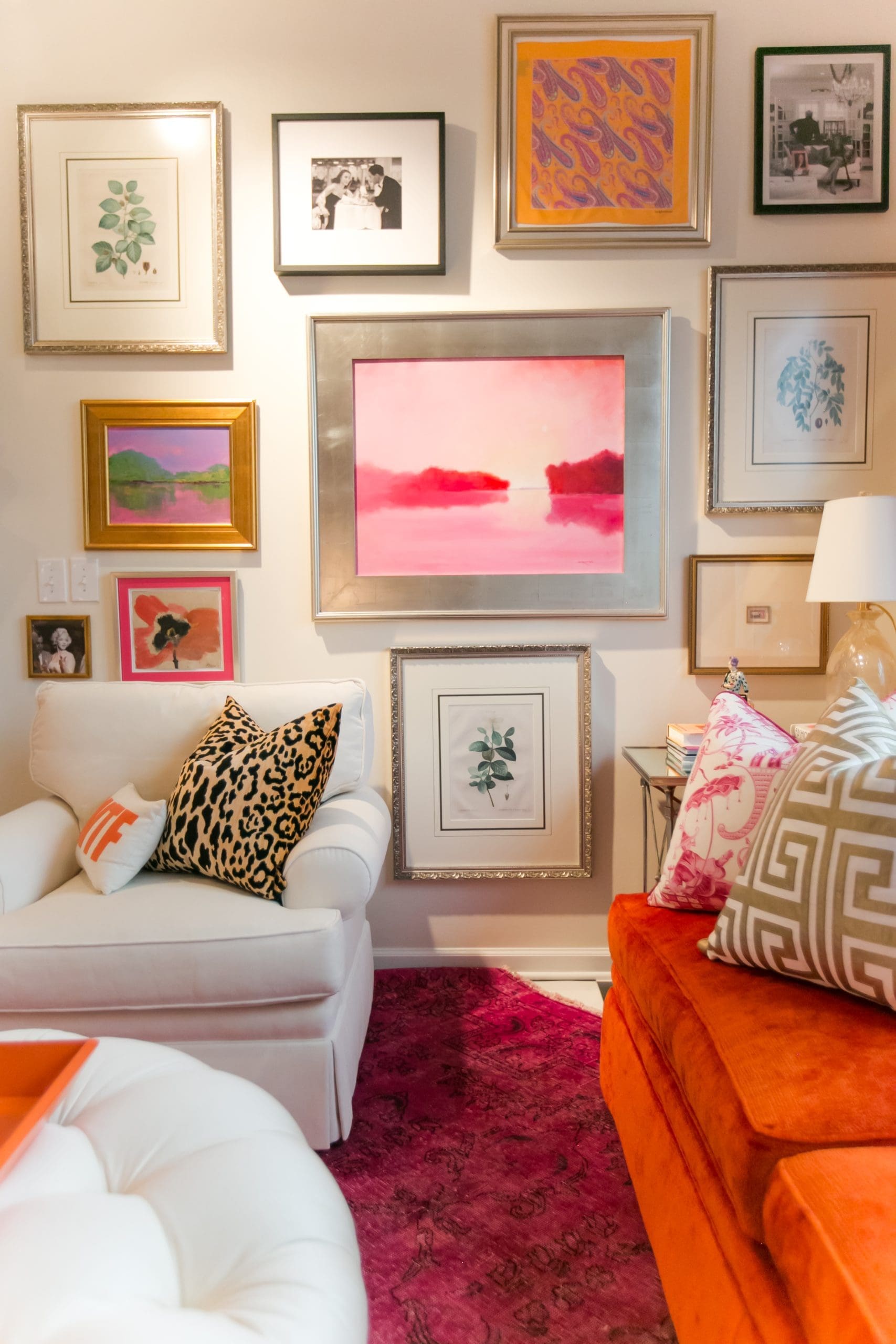
Many people may have a gallery wall in their home – even the most minimal decorators. For a more maximalist gallery display, introduce varied sizes of frames, showcasing a selection of items important to you – not only photography and artwork, but objets d’art, framed mementos and even lighting fixtures can be incorporated.
“I believe that no room is complete without a layer of authenticity. This could be an antique chandelier, art housed in old gilt frames, a vintage rug or even a chest passed down from your grandmother,” shares Lantz.
The scale of a gallery wall can expand as well. Consider hanging the gallery from floor to ceiling, or descending the full length of a stairwell.

2. Keep it Colorful
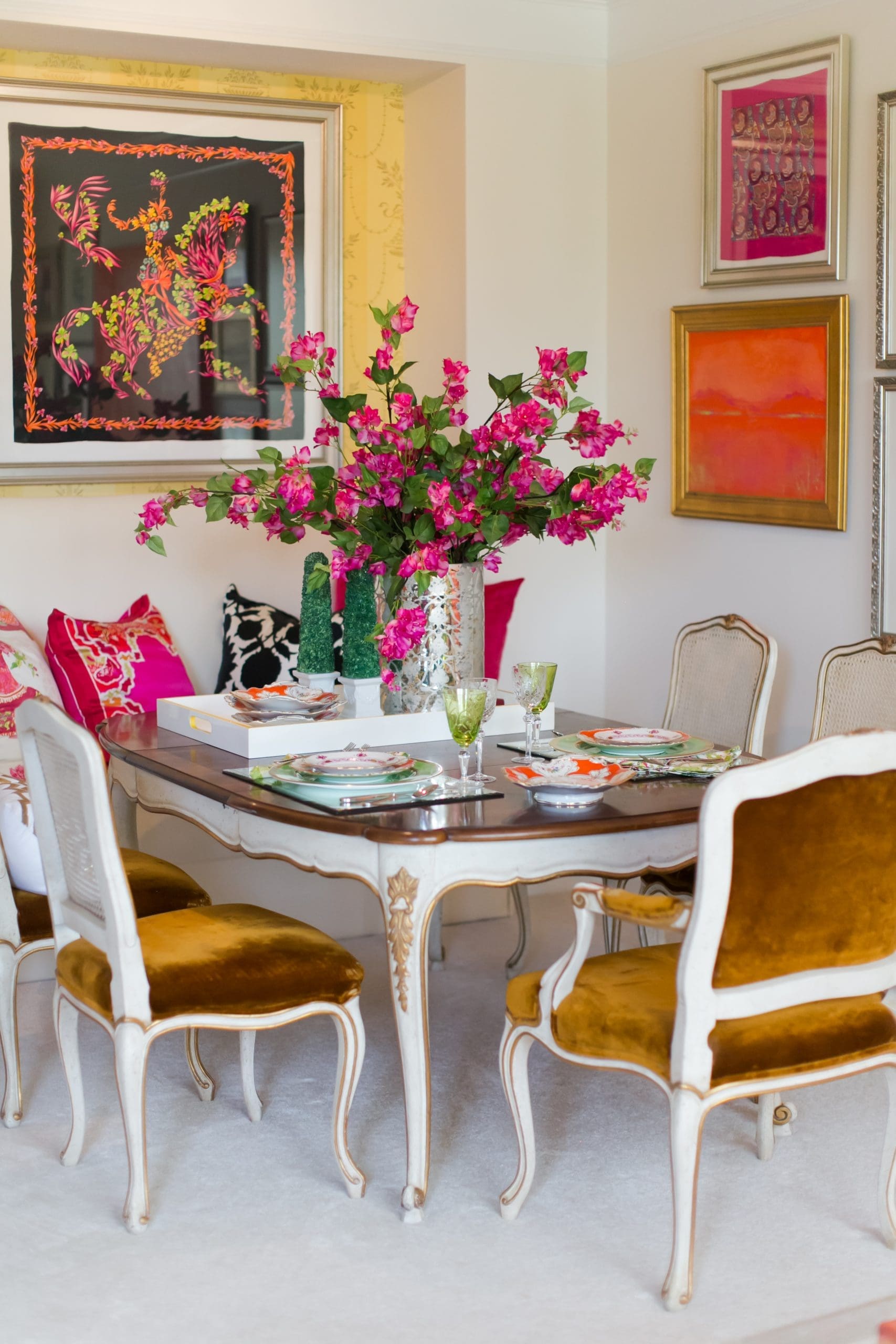
A bright hit of color introduced among a landscape of muted neutrals can go a long way in creating a maximalist appeal. A saturated paint color can completely change the way you feel in a room, or a selection of vibrant pillows or accessories in a favorite hue can be a good starting point to move out of the neutral zone.
Says Lantz, “Maximalism provides a cozy aesthetic and makes you feel that you are wrapped in all the things you love, all in one place – including color, pattern, art, objects and texture.”

3. Play with Pattern + Texture
Pattern might be the hardest element to get right in a maximalist look. Mixing patterns can be tricky. Many experts recommend mixing a large scale pattern with a smaller scale pattern in the same colorway for those attempting something like this for the first time. Lantz emphasizes that maximalism is a great opportunity to truly create a custom interior. “At A Lantz we never use the same pattern in the same color twice – avoiding that “rinse and repeat” look so prevalent in today’s interior design,” she says.
If pattern-mixing is scary, or too much of a commitment, texture is another way to bring in some pattern to an otherwise neutral room. Grainy wood floors, woven baskets, plush velvet pillows and cozy knit throws can contribute some low-stakes pattern for more visual interest.

These days you don’t have to work hard to find inspiration to create a maximalist space. Pinterest offers a trove of finds for the pattern-obsessed, and colors of the year have taken moody and saturated turns for the past few years. In addition to gallery walls, collections continue to be a staple in the design world as well. These elements combine to create an atmosphere, which is what moves Lantz the most.
“I love the look because it is more about the feeling it evokes and creating livable spaces for our clients. Also, who wants a space that looks like everybody else’s?” says Lantz.
To learn more, connect with A Lantz Design president, Amanda Lantz. You can also follow along with the firm’s Instagram Page and shop Lantz Collective at Carmel City Center.
