“Mod Abode” Blogger Designs Rooms with Personality in Drapery Street
Modern style maven, Jamie Sangar, is the creator of Mod Abode, an online design haven curated by Jamie’s discerning eye for design. In this blog series, Jamie visits the IDC showrooms to photograph and tell us what inspires her and why.
A recent visit to Drapery Street in the Indiana Design Center, had me feeling like a kid in a candy store; staring at all the choices and putting my senses to the test, realizing I could never choose just one. There were so many textures, so many colors, so many styles. Ranging in products from wallpaper to textiles and varying trims, your design options are literally endless with the immense selection.
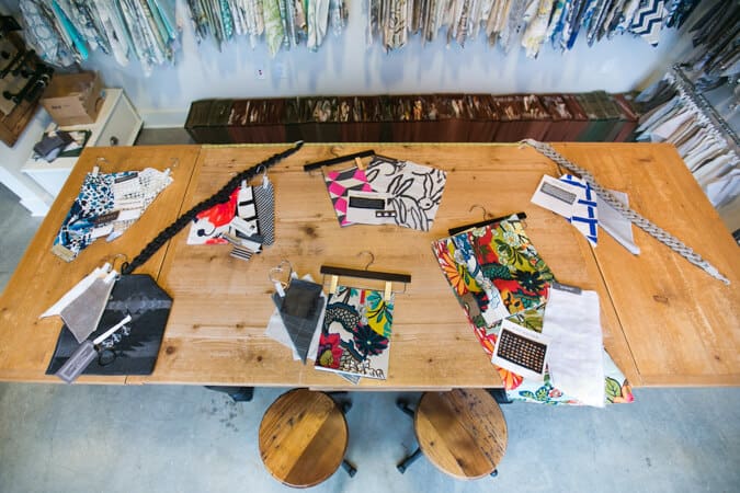
What I decided to do once I saw all of the choices available to me, was to really put my imagination to the test by coming up with a make-believe room in a home, one-by-one, and giving it a personality before picking out pieces and pairings that helped define that personality. Talk about tough choices–I was a little confused where to start.
For me, the easiest thing to do is to pick out a favorite piece for a room–a focal point, if you will, that functions as my inspiration for the room that I’m designing. Then based on that focal point or statement piece, add some flare with textures and contrasting patterns and colors.
Take a peek at the rooms I created below by giving each one its own personality.
Kitchen: “Saucy”
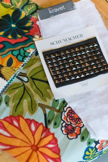
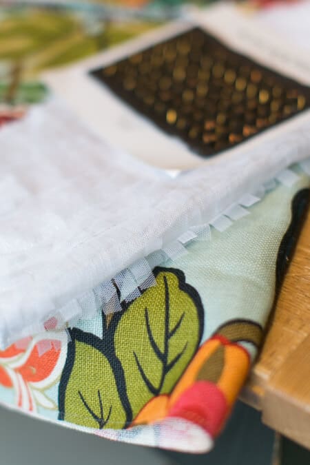
Please excuse my sense of humor for calling my make-believe kitchen “saucy!” What I mean by that is I wanted my kitchen to have a soft side to it, but at the same time have a bit of an attitude. This bold floral pattern (below) immediately caught my eye with its gorgeous color palette and graphics. Its sure to be the emphasis of any room that it’s placed in. And while I love the delicacy and the soft lines of the flowers, the tomboy in me added this bold bronze studded trim. And then to add a little dimension, I paired these two pieces with this white sheer that offers a lot of movement with the tiny cuts of fabric.
Master Bedroom: “Give and Take”
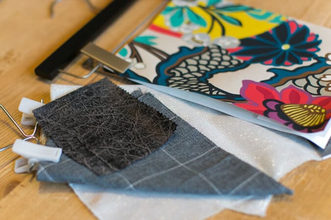
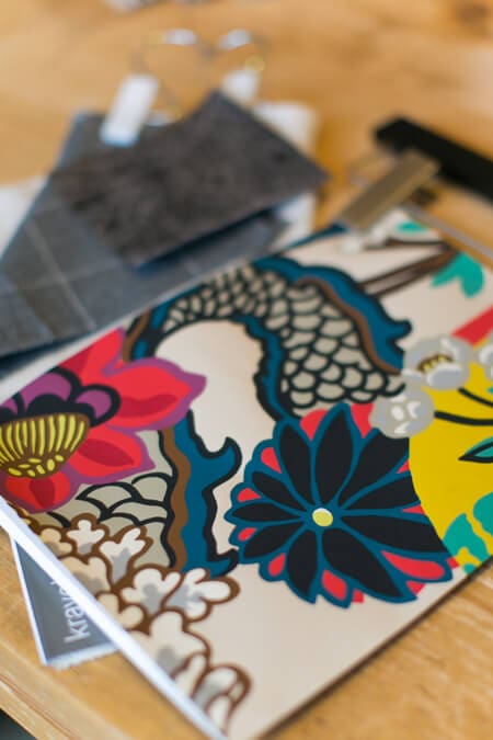
A good relationship is all about give and take, right? I gave my master bedroom this persona since this space in the home is equally shared by a couple. I wanted it to have both feminine and masculine attributes to it, as to not make one side feel uncomfortable in the room that should feel like a relaxing oasis. I was struck by the floral wallpaper, but what I specifically loved about it was the use of both feminine and masculine colors. It was the perfect focal point to set an even playing field. And then to pull in the hints of “his” side of the equation, I loved this deep, rich leather swatch paired with the grey suit pattern. And since I didn’t want “his” influence in the master bedroom to “one-up” mine, I added in a second slightly feminine touch with this beautiful fabric that adds some shimmer and sparkle to the room when it catches the light just right.
Living Room: “Softer Side”
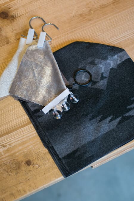
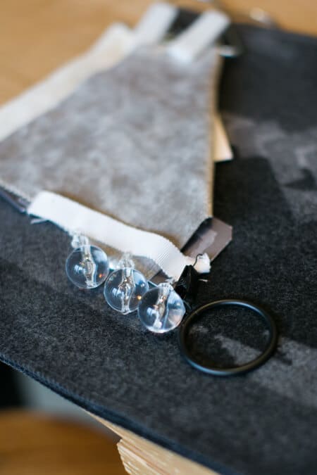
Southwestern textiles are smokin’ hot! So naturally, it was the first thing I grabbed when I was imagining what would set the tone for my living room. In my opinion, living rooms are meant for snuggling, and what better way to find that comfort than with this grey southwestern fleece. And since I like to add little surprises when pairing pieces together, I thought these crystal trim pieces were a little unexpected, but at the same time, a beautiful contrast to the bold grey and hard lines of the geometric pattern in the fleece. Topped off with a warm, shimmery fabric and a beige burlap to add some warmth, this room has me ready to sit down and kick-up my feet.
Little Girl’s Bedroom: “Big Imagination”
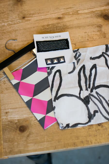
This was the easiest room for me to dream-up! Perhaps that’s because I’ve always been a sucker for decorating with black and white and pops of color. This black and white bunny textile is the perfect amount of whimsy for a little girl’s room. The abstract nature of the bunny illustration allows any little girl’s mind to run wild. And while the rebel in me wanted to find something other than the cliche color “pink” for a girl’s room, I couldn’t help but fall in love with the grey, white and bright pink wall paper. The icing on the cake was finding two different trim pieces, varying in size and shape to put the final bedazzle on the room.
Home Office: “Confidence”
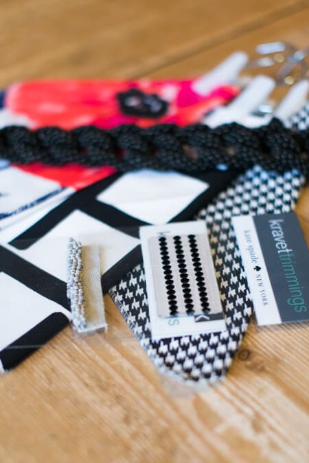
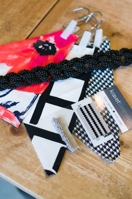
Lets face it…I work from home, and my husband has an “office job,” so that means I get to put a girly touch on this space. No one starts his or her own business being timid, so this room had to be designed with some confidence. I couldn’t think of a better, bolder option, than this poppy flower pattern. To me, this looks more like artwork than just a fabric. Not being shy, I wanted to add two more black and white patterns, drastically fluctuating in size to show my level of confidence. Since they are all two-dimensional though, I thought the braided black trim paired with a beaded trim and a polka dot accent gave the room the depth it needed.
Guest Bedroom: “In-Law Approved”
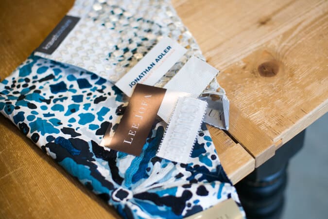
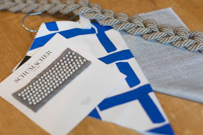
Since the guest bedroom isn’t used all that much, and the ones most likely to use that space in the home are the in-laws, I decided to come up with a slightly different palette that was a little on the “safer” side, just to keep the mother-in-law happy (ha!). I needed it to still show little signs of quirkiness though so that it flowed with the rest of my home. Blue seems like a safe color to me, so I actually pulled two different room options together below. The first blue option keeps with the floral theme that is sprinkled elsewhere throughout the home, while the second one gave me a more nautical feel. What I loved about the neutrality of all the “secondary” accent pieces that I chose for both options, was that if I ever felt like blue just wasn’t my thing anymore, I could easily swap that pattern out and introduce a new statement piece.
Goodness! I don’t mean to be so long-winded, but that’s just how amazing Drapery Street is. The team there does and amazing job at listening to your style preferences, and then coming up with a master plan for you and your home. Or if you are in the mood for a little play time like I displayed above, pay them a visit and start putting personalities and touches on your rooms.
About Mod Abode by Jamie Sangar:
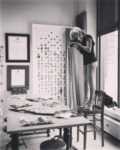 Mod Abode was started out of a passion for three things; photography, architecture and design. A photographer by trade, I figured, what the heck–why not combine all of my passions into one. Thus, Mod Abode was born! For as long as I can remember, I have loved design. I’ve always been particularly drawn to modern design. It has always been a favorite pastime to pick up the latest issue of Dwell Magazine and gawk over the stunning modern architecture and clean, minimalist interiors. And every store catalog I receive in the mail containing simple yet bold interior accessories, has a rather long shelf life in my home, because I love to study the featured rooms photographed so beautifully inside the issue. Since starting my photography business in 2006, I’ve had many opportunities to photograph our travels, our home, and lots and lots of happy moments in peoples’ lives. After being a general contractor on the build of our own modern home here in Indianapolis, Indiana, I gained an even stronger appreciation of modern craftsmanship and functional homes built with form in mind. So here you have it, Mod Abode is a broad range of things that interest me, related to modern homes, for modern enthusiasts.
